Linton's Year 12 Media Production Blog
Tuesday, 17 April 2012
Monday, 16 April 2012
Sunday, 15 April 2012
Audience Profile and Response (Question 5)
How did you attract/address your audience?
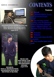
The audience was attracted the main model on the front cover holding a guitar displaying the rock genre being presented and the one that in my preliminary work was the genre that people overwhelmingly said was their genre of preference, and throughout the copy in the cover, contents and double page spread an effort was made to address some things brought up in the audience profile, for example, when Urahara is being interviewed he speaks of wanting to continually change his style of music, which addresses what the audience aggrees partially with in that people should live in the moment and in essence live impulsively, while also addressing the other part of the readership who say some consideration should be taken for the future, as he is not only being spontaneous with his change in music but also is looking to the future and doesn't want to be seen as stale and become forgotten in a sense. The pictures of Urahara working on his music further cement that he is someone who wants his music to be what he wants it to be which fits in with the profile of the Riffs audience. Finally, the tour box was used and implemented after it became clear that Riffs readers were overwhelmingly interested in going to gigs and would find it helpful for information on their favourite artists to be easily displayed in the piece allotted to them.
Tuesday, 10 April 2012
Preliminary Work
This is a very early design for a music magazine that I made in preparation for the real coursework, mainly done to familiarise myself with, and gain and display skills (or lack thereof) with the Adobe Photoshop Programme.
Basic cropping of a picture of a fellow classmate was used for the main image, and a basic background taken from Google stock photos. The magazine was based upon an idea for a school magazine.
Monday, 9 April 2012
Subscribe to:
Comments (Atom)


