
Tuesday, 17 April 2012


Monday, 16 April 2012
Sunday, 15 April 2012
Audience Profile and Response (Question 5)

How did you attract/address your audience?
The audience was attracted the main model on the front cover holding a guitar displaying the rock genre being presented and the one that in my preliminary work was the genre that people overwhelmingly said was their genre of preference, and throughout the copy in the cover, contents and double page spread an effort was made to address some things brought up in the audience profile, for example, when Urahara is being interviewed he speaks of wanting to continually change his style of music, which addresses what the audience aggrees partially with in that people should live in the moment and in essence live impulsively, while also addressing the other part of the readership who say some consideration should be taken for the future, as he is not only being spontaneous with his change in music but also is looking to the future and doesn't want to be seen as stale and become forgotten in a sense. The pictures of Urahara working on his music further cement that he is someone who wants his music to be what he wants it to be which fits in with the profile of the Riffs audience. Finally, the tour box was used and implemented after it became clear that Riffs readers were overwhelmingly interested in going to gigs and would find it helpful for information on their favourite artists to be easily displayed in the piece allotted to them.
Tuesday, 10 April 2012
Preliminary Work

This is a very early design for a music magazine that I made in preparation for the real coursework, mainly done to familiarise myself with, and gain and display skills (or lack thereof) with the Adobe Photoshop Programme.
Basic cropping of a picture of a fellow classmate was used for the main image, and a basic background taken from Google stock photos. The magazine was based upon an idea for a school magazine.
Monday, 9 April 2012
Friday, 6 April 2012
Double Page Spread Analysis 1

Half of the second page in the double spread is devoted to promoting other artists, a useful way to deliver on a spread that successfully focuses on the artist at hand (The Teenagers) and cleverly uses the lure of the interview with the hit band to draw the audience’s attention to other artists, perhaps a promotional tool requested by a label to bring attention and a wider audience to said artists. At the bottom left of the page rests a information box that highlights characteristics of the band in a short and snappy manner that would be extremely helpful for readers unaware of or new to the music of the band, and is certainly a possible option for a music magazine as a quick “catch-up” of sorts so that some readers don’t feel alienated and that all can enjoy the piece to differing degrees. The pull quote mentions how The Teenagers are seen as a sexual band, and this was specifically chosen as sexuality is one of the key aspects of the band’s image and success, as well as the fact that sex sells so it made the most sense to put an enticing pull quote such as that on such a prominent position. The picture of the band is also important, it illustrates the three casually lounging on a bed with sexually suggestive pictures on the wall behind them, again highlighting the band’s main image as a sexual band as well as relating to its target audience of teenagers.
Thursday, 5 April 2012
Wednesday, 4 April 2012
Double Page Spread Analysis 3

The article presented, featuring a main piece revolving around the music artist Professor Green, utilises several different presentational devices as well as language features to further add to the overall composition and layout of the article, which in turn creates a better image for the artist and makes them seem more interesting and is likely to grab hold of the reader’s attention. The most striking aspect of the piece is the main image of the article, which displays Green rapping into a microphone, and the picture is taken while Green is in motion to create a blur effect behind him. This blur effect was not just captured deliberately but also used deliberately to create the image for the reader that Green is proactive and takes an active interest into creating his music, as supported by the caption below the picture which states that the picture of Green was taken at a music studio, which also suggests that Green takes any musical activity as a performance. The photo is not doctored in any way and this is deliberate, as an exposition piece on an up and coming artist would usually involve a professional photo shoot and what inevitably comes afterward with liberal use of photo shopping, but it is not used here to make Green seem more down to earth and focused on simply creating his music rather than having the perfect photo op and conforming to the standards expected by music magazines when an artist seeks exposition, as well as making Green seem more focused on pleasing his fans rather than making money unlike many other musical artists, so Green is taking a defiant stance against this convention and in a way staying true to his underground roots, and ensuring the reader that he is a normal, down to earth person.
After the main image, the heading of the piece is the second most striking aspect of this piece. The heading reads: “The Nutty Professor”, which is not only a pun on his stage name but is also an example of intertextuality, by referencing other pop culture, but the effect of this is to draw in the reader and make them interested in the piece as well as the artist by using the heading to connote that Green is in some way crazy, obviously this is not real but is more used for effect and to suggest that the following copy will have information on something surprising about to be undertaken by Green. In the additional text below the heading a rhetorical question is used to further this belief and to add to intrigue created by the heading and has the exact same function of the heading: to draw in the reader and to want to make them explore the article further, as well as creating the image that the artist is quite enigmatic.
Sunday, 1 April 2012
Front Cover Analysis 1.
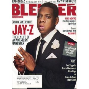
The most important aspect of any front cover of any magazine is the main image. The main image for this cover depicts the main attraction of that particular edition of Blender, Jay Z. The image of his is set to a pure white backdrop has him dressed in an expensive suit as the caption below his name reads, “The fly life of an American gangster”. While the stereotype of a rap “gangster” is usually someone akin to a thug and usually dressed “appropriately” to draw those comparisons, in this image of him supposedly being a “gangster” depicts him in a much more classic Hollywood style of gangster, brandishing his wealth at his pleasing.
Saturday, 31 March 2012
Front Cover Analysis 2

The front cover of the hip-hop orientated “XXL” magazine adheres to the stereotype given to hip-hop culture by implying and displaying an over abundance of male dominance and macho behaviour, and adheres to several musical magazine conventions through the use of key techniques such as a dominant focal point and cover story. This is similar to another hip hop magazine, “Vibe”
The most striking aspect of any music magazine is naturally the cover image. The “XXL” magazine clearly has a very strong image, which can convey a variety of different responses from potential readers and buyers. The image has several meanings which is important for a magazine attempting to appeal to a broad purchasing base to have: the image can be seen as displaying two young men you came from a harsh upbringing (suggested by the dilapidated building in the background) and have achieved great success, as implied by the abundance of jewellery covering the two, illustrating the affluence that the two now enjoy. This makes the reader think that the two have enjoyed a “rags to riches” story so to speak, and could entice readers to buy the magazine to read interviews of the two which could potentially tell us more of the duo’s background. Others may just see the image as the stereotypical representation given to (and certainly adhered to by most) rappers and others involved in the hip-hop industry, emphasising the gangster vibe of the entire genre. Finally, the pose with the two rappers topless and in a friendly embrace of sorts could emphasise a degree of homoeroticism, no doubt this is a decision made by the editor and photographer designed to appeal to as wide an audience as possible no matter how subtle the indications of homoeroticism may be, as the pose represents the duo’s masculinity far more than the subtle indications suggest, as it portrays the two as overwhelmingly macho and masculine and at the same time very sure and confident about what their sexuality is, and they do not feel the need to fear showing being close friends.
Monday, 12 March 2012
Teacher Feedback
Linton, I am pleased that you have now added some textual analyses, of which shows insight and a good understanding of the key features. However, you stilll have a lot to upload to your Blog.
Targets: 1) Meet deadlines - this is part of the criteria
2) Complete front cover and contents page by 16/03/12
Targets: 1) Meet deadlines - this is part of the criteria
2) Complete front cover and contents page by 16/03/12
Saturday, 3 March 2012
Teacher Feedback
Linton, I am concerned about the lack of research and planning evident on your Blog despite the reminders given. You MUST ensure completion of all tasks as per the checklist by Friday 9th March in order to prevent failure in this aspect of the coursework.
Monday, 13 February 2012
Teacher Feedback
Linton, I have seen some evidence of your research and planning work in lessons but you must now upload all of this work ASAP so that I can mark it. Please attend to this by the end of half term.
In addition, you must upload your preliminary task and all of the work completed around this task.
In addition, you must upload your preliminary task and all of the work completed around this task.
Monday, 6 February 2012
Subscribe to:
Comments (Atom)